


The Challenge
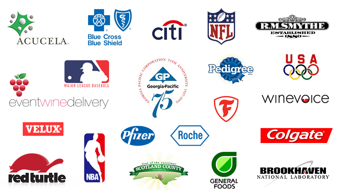
Georgia Pacific Corporation celebrated 75 years in business. They required a unique logo to celebrate the event.
The Result
Combining the existing logo with large numbers "75" presenting the amount of years Georgia Pacific has been in business. We created a beautifully balanced circular mark with the GP logo centered, surrounded by descriptive copy. A decorative font was selected for the numbers to give the final mark an elagant look, the numbers appear to moving upwards to give the mark a positive feel, and the corporate color blue was applied to visually tie the numbers with the company logo. The surrounding text is in red to separate and compliment the corporate brand.
More selected projects
General Inquiries
info@deffenbaugh.com
Phone
+1 206 300-8051
Offices
New York
Seattle
San Francisco
Charlotte