
The Challenge
Based in downtown Seattle, this new company began developing therapeutics to treat or slow the progression of sight-threatening ophthalmic diseases. Its founder, a University of Washington Professor came to us with an opportunity to create and implement the new Brand Identification.
The Process
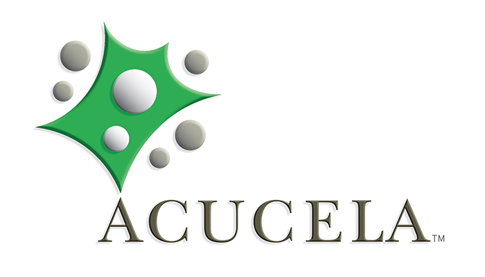
We began by creating a name, combining parts of two words, Aqua and Cell, both a important part of the company's unique in vitro process. The new logo will be required to communicate across cultural borders, so the inclusion of a symbol as part of the logo was important.
Aqua + Cell = Acucela
The design of the symbol was based on a cell distorted to create the existing shape. We centered it above the "A" so it appears the discovery is coming from inside the company. A elegant serif font, presented in all caps was selected for the name to contrast with the organic shape of the symbol to communicate a serious tone for the identity. Green was selected for the symbol for its association with nature.
The Result
Acuclea is now a well known name within the Pharmaceutical industry. The company resently went public on the Toykyo Exchange bringing in over $162 million in total proceeds.
Acucela with its original founder continue to develop new treatments for eye diseases.
